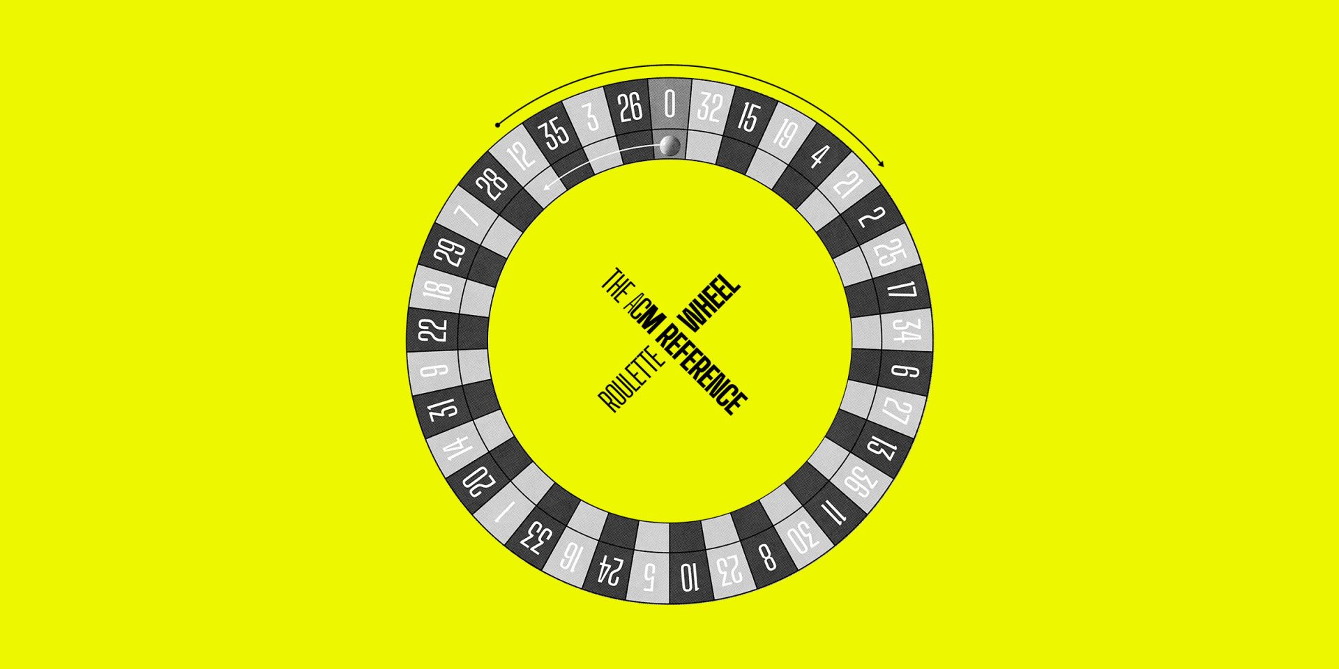
Come Spin The Great ACM Reference Roulette Wheel
Are you totally sure you want to do this?
What you’re about to experience has never happened in ACM history. We’ve never even dared to attempt to make it happen, if we’re completely honest – what lies on the other side is uncharted territory, which makes you, dear reader, either very lucky indeed, or at risk of catastrophic cranial overstimulation. Fingers crossed for you.
Somehow, we’ve convinced (/pleaded with, in order to hit a pretty tight newsletter deadline) two ACM ideasfolk to unlock their protect-to-the-death reference folders, and share a number of entries at random.
Let us just stress the magnitude of this – a reference folder is an ever-growing bank of curated gold that’s been unabashedly stolen along a creative’s journey through life (read: the internet, during lunch) and years and years in the making. Art, theft, etc.
You can tell a whoooole lot about someone from their refs folder – where they’ve been, their daily habits, personal tastes, who they look up to, the weird subreddits they hang out in, PIN number – which is probably why they’re always so overprotective. We know, and have worked with, editors and art directors at the country’s biggest publishing houses who would sooner run their hard drives through a bandsaw and blazing petrol fire before offering you a peek inside their creative Fort Knox.
So yes, consider this a one-off, non-refundable ticket into one of ACM’s most closely guarded creative secrets.
We gave Chris and Daniele, our senior creatives, a list of numbers from 0-36. We then asked them to take those numbers, open their magical folders, slap their ‘down’ keys a corresponding number of times, and show-and-tell us the random reference they landed on. Here’s what they churned up…
NUMBER 3: 10 CHAISES, BY DOMINIQUE EHRHARD
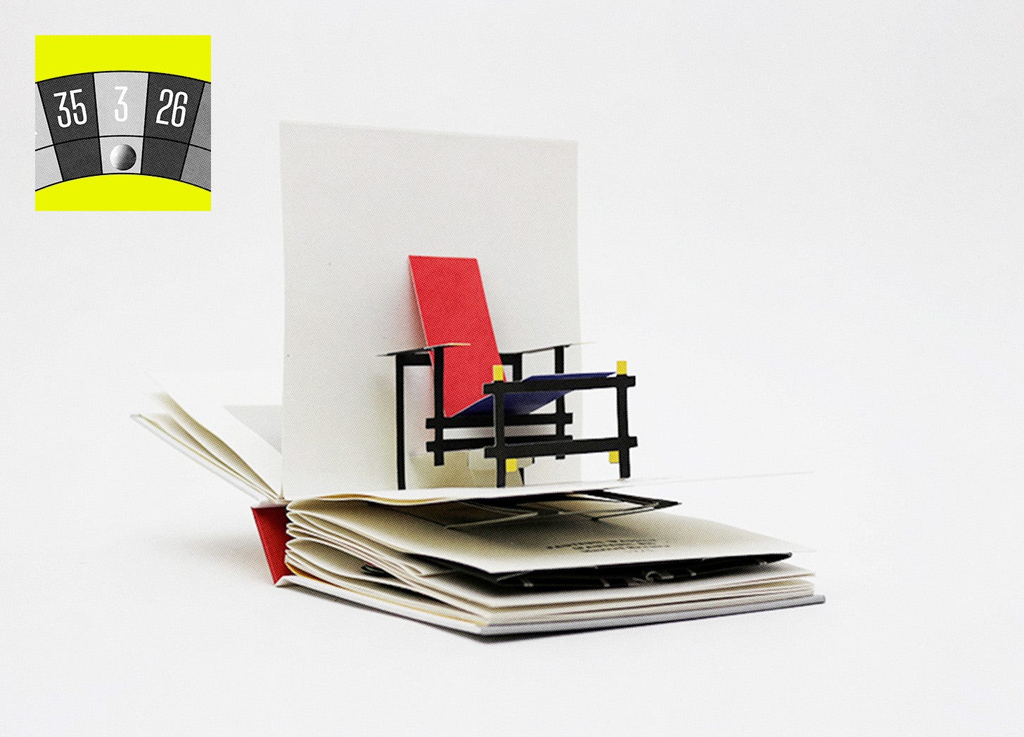
Daniele: “My first exam at university was about chairs. I had to draw 100 of them. Some are in this – a pop-up book of my favourite chairs. That Instagram profile, by the way, is an avalanche of good taste. Curated by two brilliant artists, George Wu and Malika Favre.”
NUMBER 23: STEVE MARTIN’S BUSINESS CARD
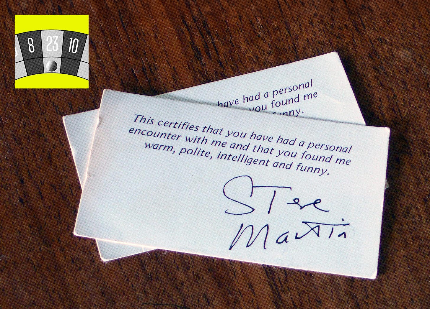
Chris: “It’s the endearingly self-aware arrogance that I love. Rumour has it that Steve Martin only handed these out for a couple of months in the 80s, but a unique take on a soulless, meaningless “To XYZ, best regards, Famous Person” copy convention? That’s a bit of me, that is. It’s just reminded me of this incredible compendium of 1970s-80s Chicago gang business cards, too.”
NUMBER 13: THE CLASSIC SWEAR JAR, BY NICK DYNAN
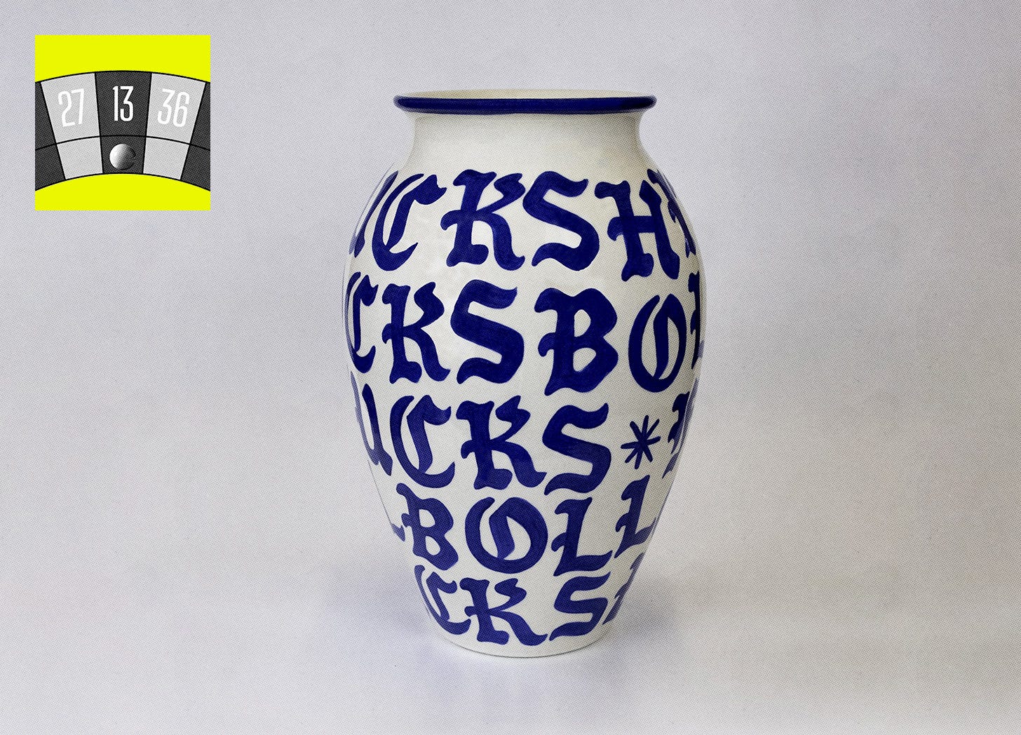
D: “The idea, the craft, the… swears? I’ve pulled this out of my ‘Mary Poppins Style’ reference folder. Nick Dynan’s creation ticks boxes you never knew you wanted to tick.”
NUMBER 24: PITCHFORK X JEFF GOLDBLUM’S ‘OVER/UNDER’

C: “Hahaha, I’ve not seen this for ages. It’s a hangover from my mainstream magazine days, from the exact moment the slow-moving juggernaut of a publishing house that I worked for realised the internet wasn’t a rival to print but a tool it needed to harness. I love the simplicity of this format, and still come back to it when thinking about uncomplicated approaches to influencer content or editorial storytelling for our clients, such as recent cross-platform work for Brompton.”
NUMBER 33: THE FULL WORKS OF MIKE MCQUADE
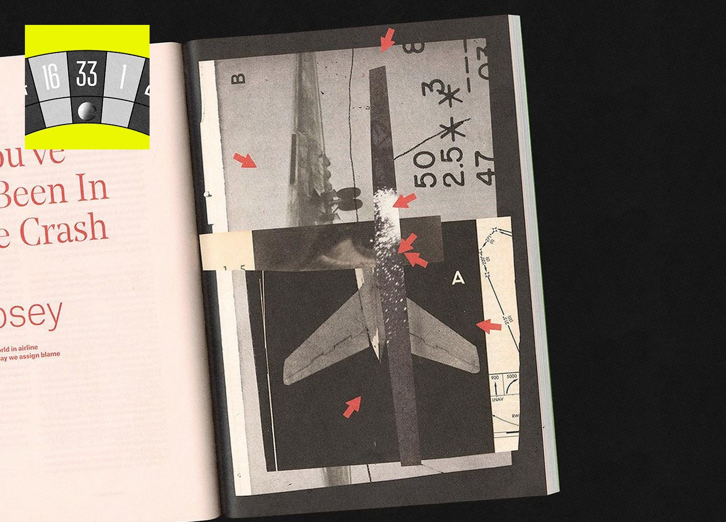
D: “A random illustration from Mike McQuade. He works with the best magazines because he is one of the best. If you love a torn-paper texture, half-toned images, vintage-like visuals, and vibrant palettes, you’ll love Mike as much as I do.”
NUMBER 12: NYT MAGAZINE COVER 9.11.22
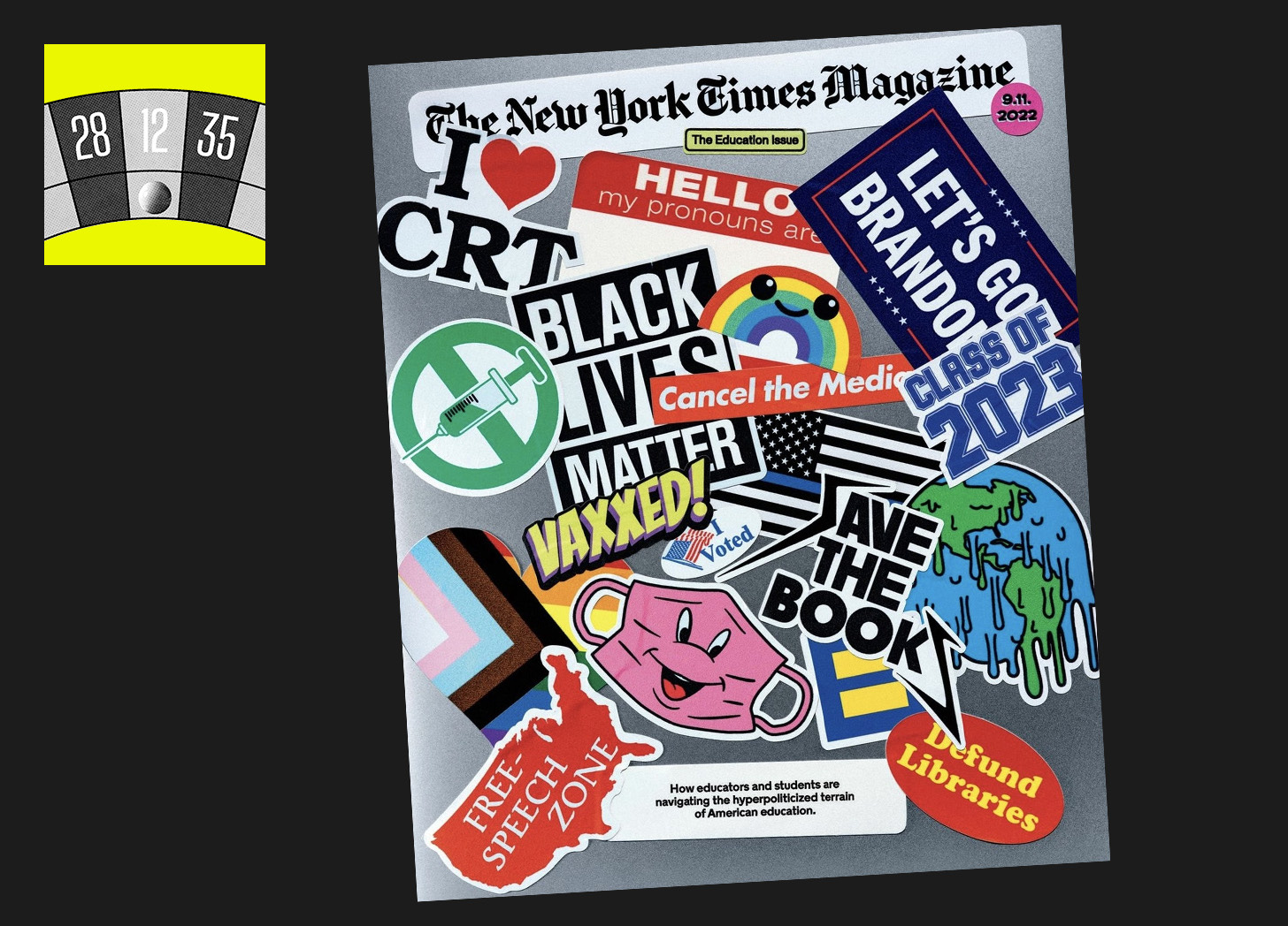
C: “Call it a symptom of growing up with 90s/00s action sports, but sticker culture is a bit of a theme through my folder. I’ve got a huge envelope of brand stickers somewhere, all yet to find homes.”
NUMBER 18: NEEDLE & THREAD, BY LERNERT & SANDER
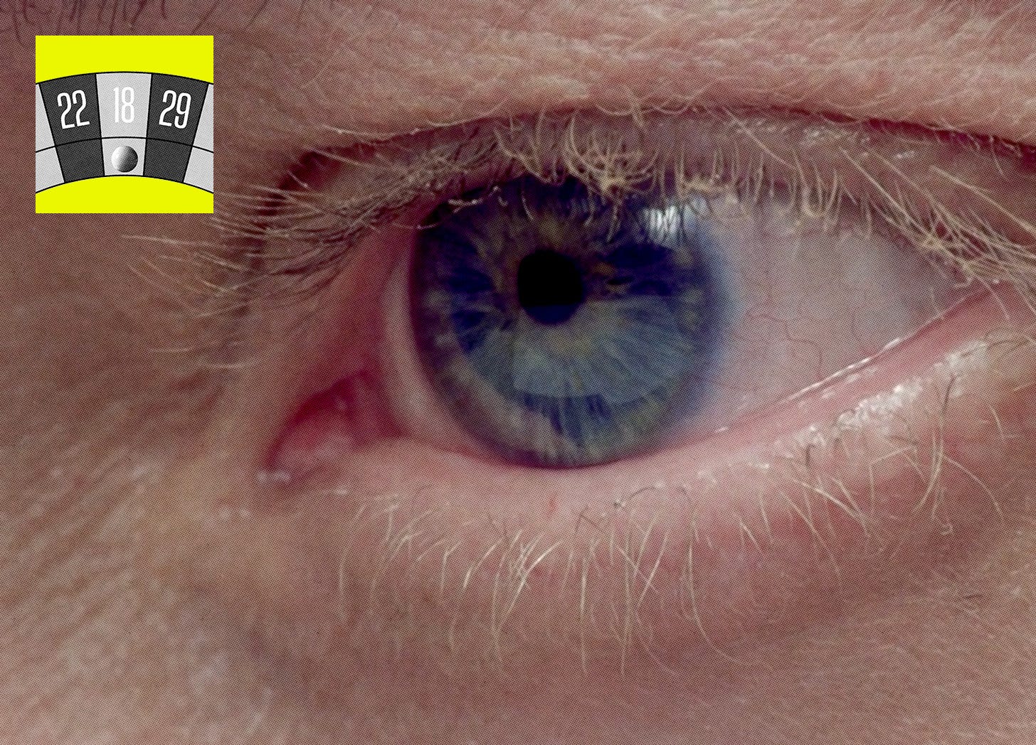
D: “A video of a man putting a thread into a needle. Nothing to be tense about, right? So so wrong. Lernert & Sander are behind my most used references for visual storytelling. With their minimalistic approach (no words, no voiceover, no fluff), they cause me all sorts of feelings.”
NUMBER 7: OUTDOOR RECREATION ARCHIVE
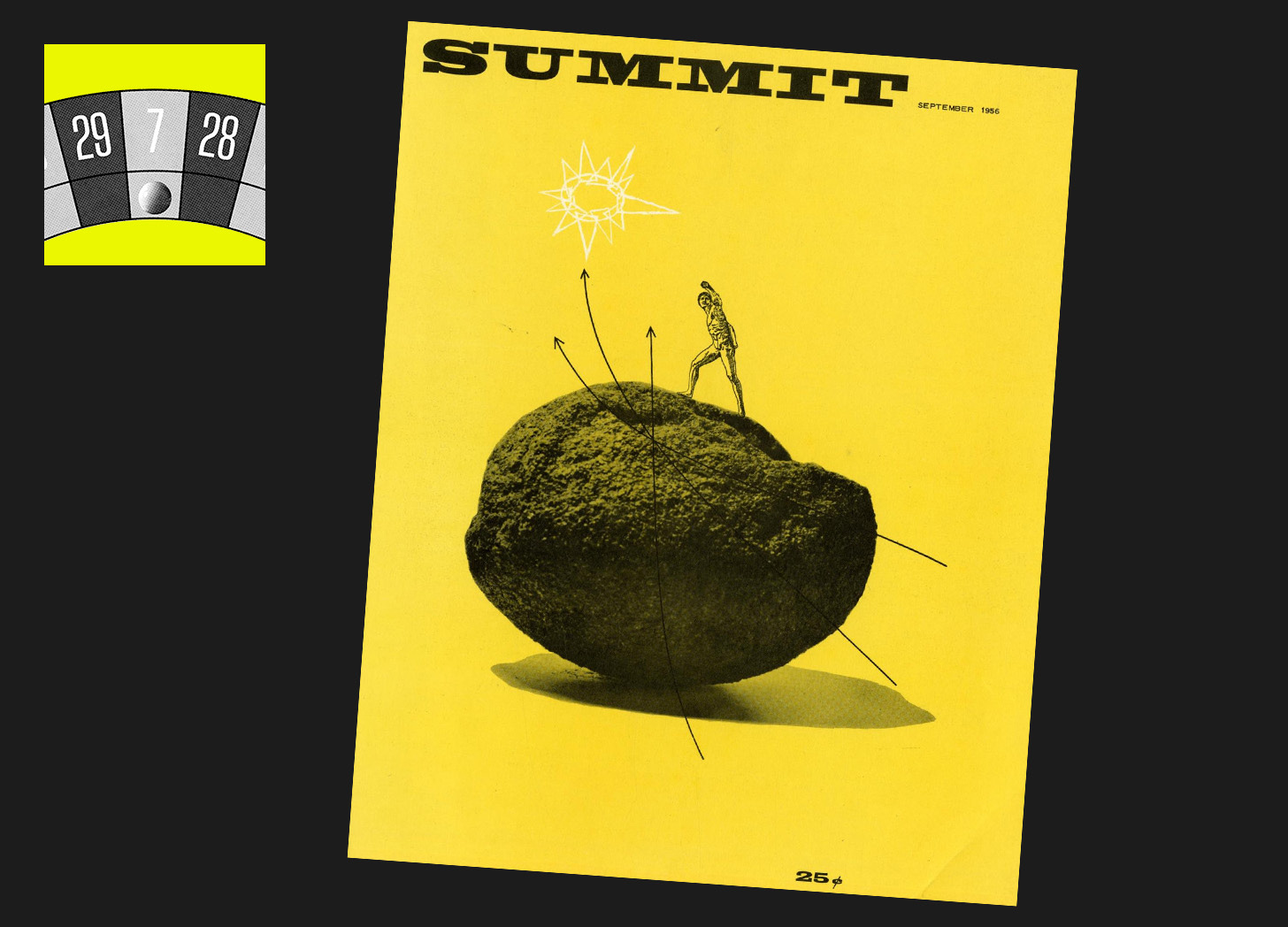
C: “Yeah I’m not surprised I’ve landed on a mention of this – about 5-7% of my bulging refs folder is made up of screengrabs from this IG account. It’s a full library of historical outdoor printed artefacts, from Patagonia catalogue covers to Eddie Bauer adverts, product shoots to magazine covers (like this favourite from 1956). It’s run by a nice chap called Chase out in Utah, who I’ve chatted to a few times about some of our clients. I found him when I was running social media accounts for The North Face right across Europe. His work featured heavily in a mood board I created for an ACM redesign proposal in 2023 – a direction we decided not to take, and that I guess you’ll just never get to see.”
NUMBER 26: FORM UND TECHNIK COVER, DEC 1965
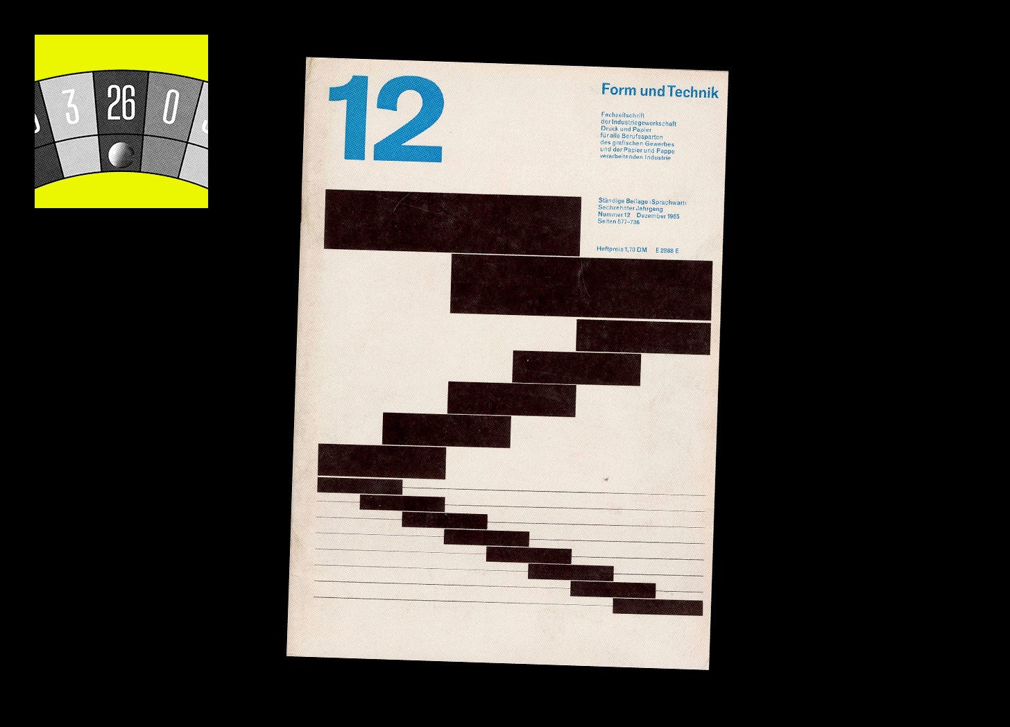
D: “Designers love grids, big type, small type, basic shapes, and white space. And this, from late 1965(!), is a great reference I used when redesigning the ACM visual identity last year. Makes you suddenly want to subscribe to a ‘trade journal of the industrial union printing and paper for all branches of the graphic trade and the paper and cardboard processing industry’ doesn’t it.”
NUMBER 8: SUB POP’S “NOT THE BEST, BUT PRETTY GOOD” TEE
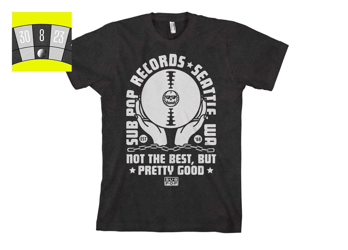
C: “I love the anti-marketing sentiment of this. I also love that the team behind it had to be super small and independent – too many layers of corporate approval would have led to someone getting cold feet and binning it. It’s such a great representation of its heritage – for me, Sub Pop, as the label at the core of Seattle grunge, epitomised the long-haired DGAF attitude back in the 90s.”
*BONUS BALL* PORSCHE X LEMANS
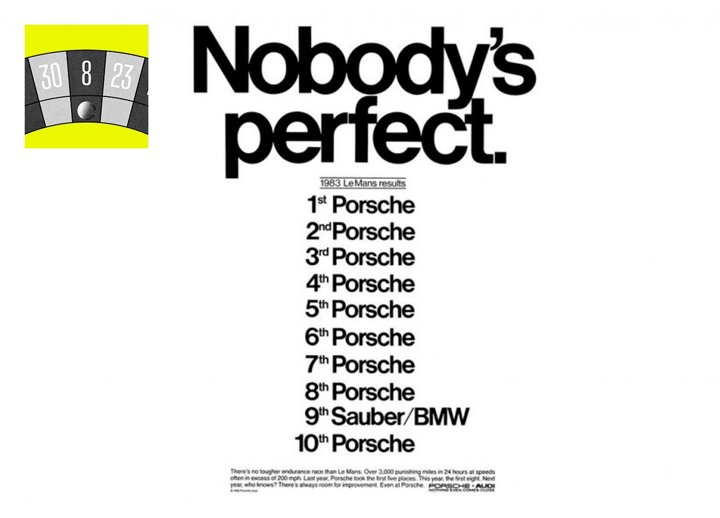
C: “Gotta drop this one in here too. The above sentiment totally reminds me of this old Porsche ad reference – one of about fifty visuals I used in some out-of-home creative consultation sessionswith our pals, Db.”
NUMBER 31: FITC WEB UNLEASHED, 2019
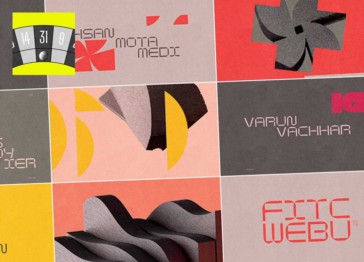
D: “Almost everything I like is in this opening sequence: the mix of 2D and 3D, cool type animation, sleek transitions. This was another important reference in the ACM redesign, this time informing the way we now approach animation.”
NUMBER 11: HERBUS, BY ELLIOT GRUNEWALD
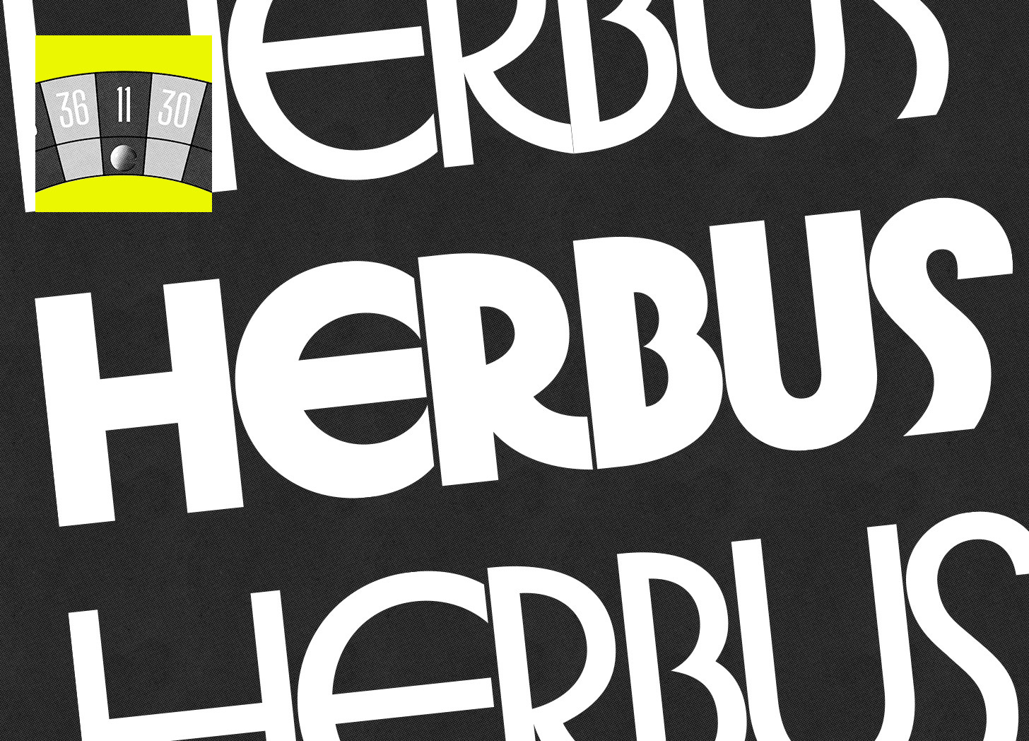
C: “I was sitting at my parents’ house on Christmas Day when I first saw this font. An American magazine had used it in a ‘People We’ve Lost In 2023’ feature, which isn’t your usual festive read. But on this most inappropriate of days, I messaged my pal, magazine art director and font of all font knowledge, Will Jack, about it so we could gush over it in tandem. It’s dripping in 70s NYC goodness and, I’m not sure why, takes me right back to watching Ghostbusters on VHS. Can’t explain that one, which makes it even more enjoyable.”
NUMBER 9: THE RETRO LINK
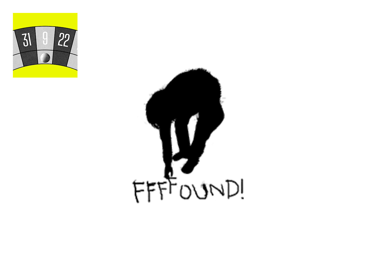
D: “I’m going rogue and, instead of a visual, serving up some nostalgia for those who once experienced FFFFOUND!. I used to go there to find my most random references. I can fully say that it shaped my existence, my love for graphic design, typography, and chaos. RIP, friend.”